cordova를 이용해서 하이브리드 앱으로 제작하던 도중,

네이티브 앱이 아닌 모바일웹이다보니 자꾸 버튼이나 a태그를 선택할 때 텍스트에 영역이 잡히는 현상이 발생하였다.

그럴 경우엔

* { -ms-user-select: none; -moz-user-select: -moz-none; -khtml-user-select: none; -webkit-user-select: none; user-select: none; }

위와 같이 CSS를 주면 해당 선택자는 드래그가 되지 않는다.

나는 마우스오버했을 때 버튼이 돌아가는걸 만들었다.

서론 필요없고 소스부터

#chatBtn { width: 50px; height: 50px; border-radius: 50%; background: url("/images/btn_chat.png") no-repeat center #9736e5; } #chatBtn:hover { background-color: #A13AF5; -webkit-animation:spin 3s linear infinite; -moz-animation:spin 3s linear infinite; animation:spin 3s linear infinite; } @-moz-keyframes spin { 100% { -moz-transform: rotate(360deg); } } @-webkit-keyframes spin { 100% { -webkit-transform: rotate(360deg); } } @keyframes spin { 100% { -webkit-transform: rotate(360deg); transform:rotate(360deg); } }

infinite속성은 끊임없이 반복하기위함

한번만 돌게하려면 infinite는 빼면된다


아래는 적용한 예제임


'Programming > CSS' 카테고리의 다른 글

텍스트 영역 선택(드래그) 방지  (0) 2018.03.30
미디어 쿼리 정의부터 예제까지  (0) 2015.12.28
CSS 미디어쿼리로 print mode  (0) 2015.12.28
꼭 알아야할 CSS Tip  (0) 2013.03.13
css 초기화 선언  (0) 2013.02.26

1. 미디어 쿼리(Media Query)란? :

media의 종류에 따라 특정 css 스타일을 적용하고자 할 때 사용하는 css 스펙 가운데 하나

데스크탑 브라우저, iPhone, iPad 모바일 브라우저 등에 스타일 시트를 구분하기 위해 사용


2. 미디어쿼리의 역할

CSS에서 최초로 스크린의 종류(모니터 or 프린터 등)를 감지할 수 있게 되었고 CSS3에서 더 상세하게 변경되어 해상도, Landscape/Portrait(가로/세로)감지가 가능하게 되었다.


3. 미디어 쿼리 사용가능한 브라우저

CSS3속성이므로 최근에 출시된 브라우저들에서 지원 가능

미디어 쿼리를 지원하지 않는 브라우저는 조건과 상관없이 CSSS를 읽게 된다.

  • PC용 브라우저 : MS익스플로러9+(8이하 지원X), 파이어폭스, 사파리, 크롬, 오페라 등

  • 모바일용 브라우저 : iOS, Android 브라우저


4. 문법 :

@media = “[ only | not ] 미디어 타입 and (미디어 속성 : 값) {…}”


(1) 마크업에서 css파일 분기(http request를 발생시켜 성능을 저하시킴)

<link rel="stylesheet" type="text/css" media="only all and (min-width:600px)" href="test_media_query.css" />


(2) style 태그에서 media 선언(inline으로 적용해야 하기때문에 유지보수에 어려움)

<style type=”text/css” media=”screen and (max-width:480px)”>

</style>


(3) css 내에서 media 선언(BEST)

@media screen and (min-width: 400px) and (max-width: 700px) { … }


  • only 또는 not으로 뒤의 조건을 한정함

- only : 미디어 쿼리를 지원하는 브라우저에서만 조건을 인식하도록 하는 키워드로 생략가능하며

생략 가능하며, 생략 했을 때 기본값이 only로 설정된다.

 (IE8이하버전을 제외한 모든 브라우저가 미디어 쿼리를 지원하므로 “only”를 사용하지 않아도 문제 없음)

- NOT : 해당 미디어 타입을 제외한 다른 미디어타입에 대응할 경우에 사용하는 키워드

  • 미디어 타입(media type) : “all”, “screen”, “print” 등

  • 미디어 속성 (media feature) : ‘min-width’ ‘320px’와 같은 해당 값의 쌍을 ‘:’으로 연결하고 괄호로 둘러싸서 조건을 표현

  • 미디어 타입을 사용하지 않으면 ‘all’로 이해하고, ‘(미디어 속성 : 값)’ 조건은 ‘and’ 또는 쉼표 ','로 연결하여 동일한 스타일에 여러 조건을 적용할 수도 있다.(“and”=AND / “,”=OR)

  • 미디어 쿼리는 문장 내에서 대소문자를 구분하지 않는다.

  • 공통, 모바일, 테블릿&데스크톱, 테블릿, 데스크톱 순으로 코드를 분리해서 작성


5. 미디어 타입

현재 HTML5/CSS3의 미디어 타입 종류는, HTML4/CSS2에서 정의된 것들을 그대로 사용하고 있다.

미디어쿼리에서 사용할 수 있는 미디어 타입은 다음과 같다.

all

모든 미디어 타입

aural

음성 합성 장치

braille

점자 표시 장치

handheld

손으로 들고 다니면서 볼 수 있는 작은 스크린에 대응하는 용도

print

화면을 인쇄할 경우 출력화면의 스타일을 표현하기 위한 용도.

웹 페이지를 인쇄할 때 @media print {..} 영역에 지정한 스타일이 우선적으로

적용됨.

projection

프로젝터 표현 용도

screen

컴퓨터 스크린을 위한 용도

tty

디스플레이 능력이 한정된, 텔렉스(teletype), 터미널, 또는 수동 이동 장치 등, 고정 피치(fixed-pitch:폭이 일정) 글자를 사용하는 미디어를 위한 용도

tv

음성과 영상이 동시 출력되는 tv와 같은 장치

embossed

페이지에 인쇄된 점자 표지 장치

위 타입 중 실제로 많이 사용되는 것은 'all', 'screen', 'print'이다.

handheld 타입의 경우 주의가 필요하다. 휴대용 기기라고 해서 요즘의 스마트폰 등의 모바일 기기가 연상 될 수 있는데, 실제로 아이폰이나 안드로이드에서는 screen에 대응하고 있다.


6. 조건문이 될 수 있는 특징(미디어 속성)

미디어 쿼리의 조건문에는 다른 프로그래밍 언어에서 사용하는 “>”, “<”, “=” 등의 연산자를 사용하지 않고 css에서 사용하는 “:”만을 사용한다.

대신, “max-” 또는 “min-”등의 접두사를 사용하여 최대값, 최소값을 통한 비교가 가능하다.


width/height : 뷰포트(스크롤바를 포함한)의 너비와 높이

@media all and (min-width:768px) and (max-width:1024px) { … }

// 뷰포트 너비가 768px 이상 ‘그리고’ 1024px 이하이면 실행

@media all and (width:768px), (width:1024px) { … }

// 뷰포트 너비가 768px 이거나 ‘또는’ 1024px 이면 실행

@media not all and (min-width:768px) and (max-width:1024px) { … }

// 뷰포트 너비가 768px 이상 ‘그리고’ 1024px 이하가 ‘아니면’ 실행


device-width/device-height : (단말기)스크린의 물리적인 너비와 높이

@media all and (device-width:320px) and (device-height:480px) { … }

// 스크린 너비가 320px ‘그리고’ 높이가 480px 이면 실행

@media all and (min-device-width:320px) and (min-device-height:480px) { … }

// 스크린 너비가 최소 320px 이상 ‘그리고’ 높이가 최소 480px 이상이면 실행

  • ‘width’와 ‘device-width’의 차이는, iPhone4 (레티나)처럼 기기 스크린은 320x480이지만 해상도는 640x960 인 경우, ‘device-width’ 는 320px이고, ‘width’는 640px가 된다.


orientation : 뷰포트의 너비와 높이 비율을 이용하여 세로모드인지 가로모드인지 판단

@media all and (orientation:portrait) { … }

// 세로 모드. 뷰포트의 높이가 너비에 비해 상대적으로 크면 실행

@media all and (orientation:landscape) { … }

// 가로 모드. 뷰포트의 너비가 높이에 비해 상대적으로 크면 실행


aspect-ratio : 뷰포트의 너비와 높이에 대한 비율

@media all and (aspect-ratio:5/4) { … }

// 뷰포트 너비가 5, 높이가 4 비율이면 실행

@media all and (min-aspect-ratio:5/4) { … }

// 뷰포트 너비가 5/4 비율 이상이면 실행

@media all and (max-aspect-ratio:5/4) { … }

// 뷰포트 너비가 5/4 비율 이하면 실행


device-aspect-ratio : (단말기)스크린의 너비와 높이에 대한 비율

@media all and (device-aspect-ratio:5/4) { … }

// 스크린 너비가 5, 높이가 4 비율이면 실행

@media all and (min-device-aspect-ratio:5/4) { … }

// 스크린 너비가 5/4 비율 이상이면 실행

@media all and (max-device-aspect-ratio:5/4) { … }

// 스크린 너비가 5/4 비율 이하면 실행


color : 단말기에서 사용하는 색상에 대한 비트 수(단위 = 자연수)(0 = false)

@media all and (color) { … }

// 출력 장치가 컬러를 지원하면 실행

@media all and (color:0) { … }

// 출력 장치가 컬러가 아니면 실행

@media all and (color:8) { … }

// 출력 장치가 8비트 색상이면 실행

@media all and (min-color:8) { … }

// 출력 장치가 8비트 이상 색상이면 실행

@media all and (max-color:8) { … }

// 출력 장치가 8비트 이하 색상이면 실행


color-index : 단말기가 사용하는 최대 색상 수에 대응(팔레트의 색상 갯수)

(단위 = 자연수)(지원하는  브라우저 없음)(0 = false)

@media all and (color-index) { … }

// 출력 장치가 색상 색인 테이블을 사용하면 실행

@media all and (color-index:0) { … }

// 출력 장치가 색상 색인 테이블을 사용하지 않으면 실행

@media all and (color-index:256) { … }

// 출력 장치가 256 색을 지원하면 실행

@media all and (min-color-index:256) { … }

// 출력 장치가 256 이상 색을 지원하면 실행

@media all and (max-color-index:256) { … }

// 출력 장치가 256 이하 색을 지원하면 실행


monochrome : 흑백 출력되는 단말기인 경우 픽셀당 비트 수(단위 = 자연수)(0 = false)

@media all and (monochrome) { … }

// 출력 장치가 흑백이면 실행

@media all and (monochrome:0) { … }

// 출력 장치가 흑백이 아니면 실행

@media all and (min-monochrome:2) { … }

// 출력 장치가 흑백이고 2비트 이상이면 실행

@media all and (max-monochrome:2) { … }

// 출력 장치가 흑백이고 2비트 이하이면 실행


resolution : 단말기의 해상력에 대응( 단위 = dpi[인치당 도트 수] / dpcm[센티미터당 도트 수] )

@media all and (resolution:96dpi) { … }

// 1인치당 96개의 사각형 화소를 제공하면 실행

@media all and (min-resolution:96dpi) { … }

// 1인치당 96개 이상의 화소를 제공하면 실행

@media all and (max-resolution:96dpi) { … }

// 1인치당 96개 이하의 화소를 제공하면 실행


-webkit-min-device-pixel-ratio : 단말기의 화소와 실제 화면의 pixel간의 비율

@media all and (-webkit-min-device-pixel-ratio:2) { … }

// 아이폰4

@media all and (-webkit-min-device-pixel-ratio:1.5) { … }

// 안드로이드


7. 반응형 웹을 만들기 위한 Viewport meta tag 설정

<meta name=”viewport” content=”width=device-width, initial-scale=1.0”>

  • 모바일 스크린에 맞게 폭과 스케일을 설정하는 태그. iOS전용 설정으로, 안드로이드는 위 설정 없이 적절하게 렌더링 된다.

(http://sir.co.kr/bbs/board.php?bo_table=pb_lecture&wr_id=167)


8. 미디어쿼리 사용시 주의점


  • IE8 이하에서는 미디어쿼리가 적용되지 않는다.

  • @import된 css 내부에 미디어 쿼리를 선언할 경우 적용되지 않는다.

  • 미디어 쿼리는 기능상의 분기는 불가능하며, 결국 css의 추가 로딩이나 css의 수정에만 영향을 주기때문에 디자인에만 영향을 줄 수 있다. 기능 지원이 안되는 단말기의 특성을 파악하여 해당 섹션을 css의 display: none 등으로 가리는 것은 가능하지만, 근본적으로 해당 기능을 단말기에서 로딩하지 않는 등의 개발 분기는 어렵다.

  • HTML5인지 확인(다른 HTML의 버전인 경우 개발에 어려움이 있음)


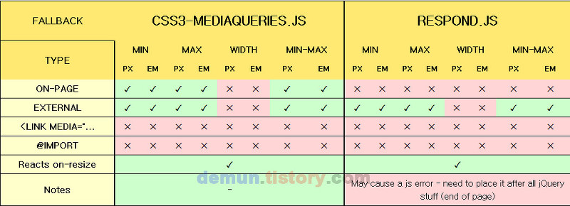
9. IE 6~8에서 미디어 쿼리를 사용하기 위한 스크립트

IE9 이전 버전에서는 CSS3 미디어 쿼리를 지원하지 않으므로,

IE 6~8을 비롯한 구식 브라우저에서 미디어쿼리가 작동하길 원한다면 Respond.js나 css3-mediaquries.js 등의 하위 호환용 자바스크립트를 이용한다.


*두 라이브러리 비교 -> http://gionaf.com/playgroud/mq-fallback/results.html


하위 호환용 자바스크립트 사용시 단점 :

Respond.js는 페이지가 로딩되기 전에 먼저 사용자가 작성한 css를 전부 분석하여 사용된 미

디어쿼리 구문을 골라내서 IE가 해석할 수 있는 방식의 css로 변환시켜 주는 역할을 함으로서 미디어쿼리의 동작을 대신 수행한다.


하지만 이러한 라이브러리들은 대개 빠른 처리를 하지 못하고 속도 저하의 주범이 되기 때문에 실제 서비스에 적용을 하는데 걸림돌이 되는 경우가 많다.


10. 미디어쿼리 예제


11. 테스트 예제


예전에 구글드라이브에 정리해놓은 글이 있어 블로그에 옮겨본다


※ Print mode(인쇄 스타일)를 적용하는 방법

1. <link rel="stylesheet" type="text/css" href="print.css" media="print" />


2. <style type=”text/css” media=”print”>

@import “print.css”;

  </style>


3. @media print {

/*직접 코드입력*/

}


  • 코드 분리, 수정을 위해 @media print{}를 활용하는것을 권장.
    (크롬 개발자도구- 설정에서 media버전을 강제 지정하여 확인할 수 있다.)

  • 프린트시 반복적으로 나오거나, 필요없는 부분은 display: none;으로 안보이도록 작업을 먼저 한 후, 프린트 모드에 맞게 수정하면 된다.

  • 인쇄물의 제목, 회사의 로고, 카피등을 고정적으로 출력하기위해서 상단과 하단에 출력에만 나오는 헤더와 푸터를 삽입할 수 있다.

  • 전체출력 외 브라우저 내 특정부분만 출력하게 하기 위해서
    <script type="text/javascript" src="../folderName/folder/jquery.printElement.js"></script>

예)

<script type="text/javascript">

$(document).ready(function() {

$("#btnPrint").click(function() {

$("#printForm1").printElement({

printMode:'iframe',

overrideElementCSS:['/asset/css/common.css',{ href:'/asset/css/common.css',media:'print'}] //print mode가 있는 css경로 입력

});

return false;

});

$('#btnPrint2').hide();

$("#btnPrint2").click(function() {

$("#printForm2").printElement({

printMode:'iframe',

overrideElementCSS:['/asset/css/common.css',{ href:'/asset/css/common.css',media:'print'}]

});

return false;

});

});

</script>


1.CSS Reset
2.IE6 CSS Bugs and Fixes Explained
3.Block and Inline Elements Explained
4.100% Height using CSS, Fixed Footer
5.CSS Rounded Corners
6.Float and Clear: A Comparison of CSS Clearing Techniques

1. CSS Reset
    -  크게 7가지로 정리해 볼 수 있을거 같습니다.
    1. The CSS Reset
        
        모든 엘레멘트에 margin값과 padding값을 초기화 시켜 줍니다.

        html, body, address, blockquote, div, dl, form, h1, h2, h3, h4, h5, h6, ol, p, pre, table, ul,
        dd, dt, li, tbody, td, tfoot, th, thead, tr, button, del, ins, map, object,
        a, abbr, acronym, b, bdo, big, br, cite, code, dfn, em, i, img, kbd, q, samp, small, span,
        strong, sub, sup, tt, var, legend, fieldset { margin: 0; padding: 0; }
        img, fieldset { border: 0; }

    2. Formatting
        body, select, input, textarea { font: 100%/1.2 "lucida sans", verdana, arial, helvetica, sans-serif; }
        font의 size와 line-height를 100%/1.2를 선언한 이유는 이러한 속성은 모든 폰트들의 적절한 공백을
        줍니다.
        기본 폰트인 lucida sans는 각자 맞게 변경해도 됩니다.

    3. The Container
        body 태그 밑에 div엘레멘트로 만들어진 container 박스가 있다면 이것으로 컨텐츠의 너비와 font-size
        를 다음과 같이 적절하게 조정할 수 있습니다.
        #container { font-size: 0.8em; width: 760px; margin: 0 auto; }

    4. Headings
        h1, h2, h3, h4, h5, h6 { padding-bottom: 0.8em; }
        heading 태그의 간격등과 같은 것은 위와같이 선언하여 주고

        h1 { font-size: 2em; }
        h2 { font-size: 1.8em; }
        h3 { font-size: 1.6em; }
        h4 { font-size: 1.4em; }
        h5 { font-size: 1.2em; }
        h6 { font-size: 1em; }
        각 태그에 맞게 글꼴을 선언하여 준다.

    5. paragraph
    p { padding-bottom: 1.2em; }

    6. Reusable CSS Classes
    다른곳에서도 재사용 가능한 클래스명을 사용한다.
    .error { .. }
    .confirmation { .. }

    7. Fieldset과 Legend

        <form method="get" action="css-reset.html">
            <div class="fieldset">
                <fieldset>
                    <legend><span>Legend</span></legend>
                </fieldset>
            </div>
        </form>

        div.fieldset { border: solid 1px #999; padding: 1em; margin: 1em 0; }
        legend span { display: block; font-weight: bold; font-size: 1.4em; color: #000; }
        
        ie6에서는 fieldset에 배경색을 주게 되면 보겠지만 fieldset의 영역이 정상적으로 잡히지 않는다. 
        즉, 이러한 문제는 position:relative나 기타 여백같은 것들이 다른 브라우져들과 동일하게 보이지
        않는 문제가 생길 수 있다.
        이러한 문제를 해결하기 위해서 div태그를 감싸서 사용하고 있고 
        legend내 span태그의 사용은 legend태그는 오직 inline contents를 포함 할 수 있다. 
        이런한 문제 때문에 fieldset과 legend태그의 스타일은 전부 제거하고 대체하는 div와 span
        태그에 스타일을 적용하여 준다.
        html validation은 유효하다.

2. IE6 CSS Bugs and Fixes Explained
    1. 웹표준을 사용하여 만든다.
        - Doctype을 사용하여 여러브라우져들에 생길 수 있는 문제들을 최소화 시킬 수 있다.
    2. Double Margin Bug
        - #navigation { float: left; width: 200px; margin-left: 10px; display: inline; }
        - #content { float: right; width: 500px; margin-right: 10px; display: inline; }
        float속성과 margin값을 써줄 경우 ie6에서 Double Margin Bug가 발생한다. 이것을 막기 위해서는
        display:inline 속성을 작성하여 주면 된다.
    3. hasLayout
        - 이것은 ie/win에만 존재하는 속성이다. 이러한 속성으로 인하여 css를 적용할때 특이한
          버그 들이 많이 발생한다. 여기서는 자주 발생하는 박스 모델과 관련해서 설명할 것이다.

            #container { background-color: #CCC; overflow: hidden; }
            * html #container { height: 1%; }
            #navigation { float: left; width: 200px; margin-left: 10px; display: inline; }
            #content { float: right; width: 500px; margin-right: 10px; display: inline; }

            Container 속성에 overflow:hidden 속성을 주어 container내의 navigation과 content의 float속성을
            제거하려고 한다. 대부분의 브라우저들이 잘 적용이 되지만 ie6에서는 해제가 되지 않는다.
            float을 제거하는 방법은 여러가지가 있지만 float을 적용시킨 컨텐츠를 감싸고 있는 태그에
            너비나 높이 값을 줌으로써 해결 할 수 있다. 하지만 이것은 사이즈를 고정시키는 효과를 나타내기
            때문에 원하지 않는 해결방법일 것이다. 
            대신 min-height와 같은 속성을 줌으로써 해결 할 수 있다.
            ie6에서만 적용되도록 *핵을 사용하여 height:1% 최소한의 높이를 줌으로써 float과 관련된 hasLayout
            버그를 해결 할 수 있다.

    4. Small Height Bug
        - 이 버그의 이름을 정확하게 명칭해서 부를 수는 없지만 경험에 의해서 이름을 붙여보았다.
          #corner { width: 10px; height: 2px; background-color: #C00; }
          이렇게 height:2px만큼만 높이를 주고 싶지만 ie6에서는 높이값에 의해 컨텐츠의 높이가 정해지는것이
          아니라 font-size에 의해서도 변동이 있다. 즉 ie에서도 위와같이 적용하고 싶다면 아래와 같이 속성을 
          추가해주면 된다.
          혹은 font-size대신 overflow:hidden; 속성으로 적용시킬 수 있다. (타브라우져에서도 문제는 없었다.)
          #corner { width: 10px; height: 2px; background-color: #C00; font-size: 0; }
          #corner { width: 10px; height: 2px; background-color: #C00; overflow:hidden; }

3. Block and Inline Elements Explained
        1. Block Elements
            - 페이지의 전체 너비나 자연스럽게 새로운 라인으로 보여준다. 
            <div>, <h1>.<h6>, <p>, <table>, <ul>, <ol>, <dl>, <li>, <dd>, <form>, <blockquote>, 
            <pre>, <address>, <fieldset>
        2. Inline Elements
            - 컨텐츠가 필요한 만큼의 너비만 요구하고 새로운 라인을 강제하지 않는다. Inline Elements 내에서는
              Block Elements를 같이 쓸 수 없다.
            <dt>, <span>, <img>, <a>, <strong>, <em>, <br>, <input>, <textarea>, <abbr>, <acronym>
        3. Not Displayed
            - 몇몇 태그들은 보여지지 않고 문서의 head태그 사이에 위치한다.
            <meta>, <style>, <script>
            
            - Block과 Inline엘레멘트 예제
            <ul>
                <li><a href="#">Home</a></li>
                <li><a href="#">About</a></li>
                <li><a href="#">Services</a></li>
                <li><a href="#">Portfolio</a></li>
                <li><a href="#">Contact</a></li>
            </ul>
            다음의 예를 보면 메뉴바를 구현하기 위한 HTML코드이다. 위에서 말했다시피 li는 블럭엘레멘트이다.
            그리고 semantic markup을 위해서는 다음과 같이 순서가 없는 리스트로 메뉴를 만드는것이 맞다.
            하지만 위에서 얘기한것처럼 블록엘레멘트는 새라인으로 변경되게하는 특성이 있다.
            그럼 의미에 맞는 마크업을 하기 해야하는데 li엘레멘트들을 inline형태처럼 옆으로 붙게 작업을
            해주어야하는데 그렇게 하기 위해선 css로 조정이 가능하다.

            li{ display:inline; list-style-type:none; } display:inline; 속성을 주면 block Elements들을 css 속성으로
            inline Element처럼 보여지게 해주는 속성이다. 즉 태그는 의미에 맞게 작성해주고 css로 block, inline
            Element의 경계를 넘나들 수 있게 해주는 것이다.

            하지만 역시 너비와 높이 값을 줄 수 없는 문제가 발생하기 때문에
            li{ float:left; list-style-type:none; } display:inline속성 대신 float:left;속성을 주어 왼쪽 정렬을 시킬
            수 있도록 해준다. float속성을 주게되면 해당 엘레멘트는 block이건 inline Element건 block 속성으로
            보여지게 하는 능력이 있다.

            inline태그인 a태그 또한 위와 같이 Block요소처럼 속성을 줄 수 있다.
            a태그에 다음과 같이 css속성인 float속성 혹은 display:block속성을 주면 된다.

4. 100% Height using CSS, Fixed Footer
        #container {
            background-color: #DDD;
            border-left: 2px solid #666;
            border-right: 2px solid #666;
            width: 676px;
            position:relative; /* needed for footer positioning*/
            margin:0 auto; /* center, not in IE5 */
            height:auto !important; /* real browsers */
            height:100%; /* IE6: treaded as min-height*/
            min-height:100%; /* real browsers */
        }

        Add these declarations to your CSS:
        #header {
            height:100px;
            background:#999;
        }

        #content {
            padding-bottom:50px; /* bottom padding for footer */
        }

        div#footer {
            position:absolute;
            width:100%;
            height:50px;
            bottom:0; /* stick to bottom */
            background:#999;
        }
        
        <body>
            <div id="container">
                <div id="header"></div>
                <div id="content"></div>
                <div id="footer"></div>
            </div>
        </body>
        { height:auto ! important; height:100%; }속성을 줄 경우 핵을 사용할 필요 없이 높이를 잡게 된다.
        또한 따라다니는 푸터 를 작업할 경우 쉽게 작업 할 수 있다.
        이 방법이 문제가 있다면 

        html, body {
            height: 100%;
        }
        .wrapper {
            min-height: 100%;
            height: auto !important;
            height: 100%;
            margin: 0 auto -142px; /* the bottom margin is the negative value of the footer's height */
        }
        .footer, .push {
            height: 142px; /* .push must be the same height as .footer */
        }

        <div class="wrapper">
            <div class="header">
                <h1>CSS Sticky Footer</h1>
            </div>
            <div class="push"></div>
        </div>
        <div class="footer"></div>

        이방법을 써보길 권장한다.

        body {
            margin: 0;
            padding: 0;
        }

        #yourbox {
            width: 300px;
            height: 200px;
            position: absolute;
            left: 50%;
            margin-left: -150px;
            top: 50%;
            margin-top: -100px;
        }

        yourbox라는 block Elements를 위, 아래, 양옆 정렬 방법이다.

5. CSS Rounded Corners
    나는 항상 라운드 박스를 만들때 고민이 된다. (나만 그럴지도 모르겠다)
    쉬운 작업 방식은 위부분과 아래부분을 잘라서 너비는 고정으로 만들면
    작업이 편하기 때문이다. 그러나 라운드 박스가 유동적으로 가야한다면

    1. 아래와 같이 위,아래, 양 옆에 있는 끝부분을 잘라 조그마한 동그란 이미지로 만든다.


    <div id="container">
    <span class="tl"></span><span class="tr"></span>
    <h1>CSS Rounded Corners Revisted</h1>
    <p>안녕 라운드박스야</p>
    <span class="bl"></span><span class="br"></span>
    </div>

    * { padding: 0; margin: 0; }
    #container { background-color: #247CBA; font-size: 0.75em; overflow: hidden; }
    * html #container { height: 1%; }
    .tl {
        background-image: url(circle.gif);
        width: 10px;
        height: 10px;
        float: left;
        font-size: 0;
    }
    .tr {
        background-image: url(circle.gif);
        background-position: 10px 0px;
        width: 10px;
        height: 10px;
        float: right;
        font-size: 0;
    }
    .bl {
        background-image: url(circle.gif);
        background-position: 0px 10px;
        width: 10px;
        height: 10px;
        float: left;
        font-size: 0;
    }
    .br {
        background-image: url(circle.gif);
        background-position: 10px 10px;
        width: 10px;
        height: 10px;
        float: right;
        font-size: 0;
    }

    container 바깥으로 네개의 span태그가 있고 float을 써서 양끝단에 이미지들을 위치시킨다. 단 높이값과 너비값을 주고
    ie에서 영역이 틀리게 잡히는 버그를 고치기 위해 font-size:0으로 설정하고 background-position을 이용하여 
    각 끝단에 맞는 영역을 위치 시킨다. 이렇게 하면 ie6,7, ff, opera, safari에서 이상없이 동작이 된다.

6. Float and Clear: A Comparison of CSS Clearing Techniques
    .f_clear:after {
        clear:both;
        content:".";
        display:block;
        height:0;
        visibility:hidden;
    }
    * html .f_clear {
        height:1px;
    }
    .f_clear {
        display:block;
        min-height:1px;
    }
    
    .menuSidebar {
        float:left;
    }
    .cointentsSidebar {
        float:left;
    }
    <div class="container">
        <div class="sidebar f_clear">
            <div class="menuSidebar"></div>
            <div class="contentsSidebar"></div>
        </div>
        <div class="footer"></div>
    </div>

    menuSidebar와 contentsSidebar에 float:left속성을 주었을때 기존의 해결 방법은

    <div class="container">
        <div class="menuSidebar"></div>
        <div class="contentsSidebar"></div>
        <div class="clear">&nbsp;</div>
        <br class="footer" />
    </div>
    이런식으로 태그를 하나 더 써서 해결하는 방식으로 적용을 했었다.
    하지만 이렇게 작업을 하였을때 단점
    1.매번 float속성을 해제해 주기 위하여 br 태그를 하나 더 쓰게 된다는 것
    2.현재 br태그로 설정되어 있지만 ie8에서는 inline태그로는 float을 해제시킬 수 없다.
       즉 새로운 브라우저가 나왔을때 br로 설정해준 태그들을 전부 바꿔줘야한다는것.


출처 : http://seye2.egloos.com/

default.css


/* reset */

body,div,dl,dt,dd,ul,ol,li,h1,h2,h3,h4,h5,h6,pre,code,form,fieldset,legend,textarea,blockquote,th,td,input,select,textarea,button{margin:0;padding:0;}

fieldset,img{border:0 none;}

dl,ul,ol,menu,li {list-style:none;}

blockquote, q {quotes: none;}

blockquote:before, blockquote:after,q:before, q:after {content: '';content: none;}

a{text-decoration:none}

legend, caption{font-size:0; line-height:0}


.hidden {position:absolute; left:-10000px; top:auto;width:1px; height:1px; overflow:hidden; }

or

.hidden {display: block; width: 0; text-indent: -9000px; overflow: hidden;}

+ Recent posts